
As users continue to shift their online browsing habits from desktops to mobile devices, the importance of accessible and efficient mobile website design grows increasingly significant. While both adaptable and responsive designs cater to these changing user behaviors, they differ in their design philosophy, development process, and final output. These differences are essential to recognize when determining which approach best fits a particular website development project.
Adaptable Mobile Website Design
Adaptable mobile web design, also known as adaptive design, is an approach that implies the creation of different layouts corresponding to distinct device types and screen sizes. The key idea of the adaptable design is its premeditated destination to function optimally on the distinct device it is being viewed on. Instead of a simplistic one-size-fits-all approach, an adaptive design delivers specific layouts tailor-made to different devices like smartphones, tablets, or desktops.
This offers a unique user experience aimed to provide the best possible display and functionality based on the specificities of the viewable device. Adaptable design uses CSS media queries and server-side techniques to detect various device characteristics, including screen size, orientation, device type, and even network connection speed. Furthermore, the adaptable design approach shows remarkable flexibility and can take advantage of newer device capabilities much faster than other website design philosophies.

Differences with Responsive Design
While both adaptable and responsive designs provide a mobile-friendly experience, they diverge considerably in their approach. Responsive design, unlike adaptive design, does not tailor multiple page formats for different devices. Instead, it employs a fluid grid concept, allowing the page's layout to change according to the screen's size and orientation automatically. So, while adaptable design offers different layouts for distinct device types, responsive design offers a single layout that adaptively fits into any screen size or device type.
A responsive design is optimally fluid and flexible, using CSS, HTML, and sometimes JavaScript to resize, hide, shrink, enlarge or move the content as needed, making it look good on any screen.Responsive web design is the more universal approach, but it can sometimes struggle to load heavy websites on small screens or slow networks due to its all-in-one approach. Conversely, adaptable design offers a more targeted user experience by serving up a layout specifically designed for the user's device characteristics.
From a development perspective, adaptable design is usually more labor-intensive and complex due to creating and maintaining multiple layouts per page. However, this also allows a more customized experience offering impeccable optimization for specific devices. On the other hand, a responsive design can be easier and quicker to develop, as it only requires coding one layout that works on all devices.
Final ThoughtsThe debate over adaptable versus responsive design is largely subjective, relying heavily on the specific needs of a business, website function, and user demographics. In essence, responsive design brings the advantage of a fluid, one-size-fits-all solution, offering a reasonable user experience across all device types with minimal page loading times.
Meanwhile, adaptable design can provide a superior user experience, adjusting and enhancing usability features more accurately to the user's specific device.Selecting between an adaptive or responsive model is not a linear decision, and often the decision comes down to the unique requirements of your business and the resources & time available. As the digital world continues to mature and diversify, the importance of mobile-friendly website design, whether adaptable or responsive, remains essential.
Therefore, businesses and designers need to stay up-to-date with these design philosophies to meet the growing expectations of mobile users in a mobile-responsive world. In conclusion, both adaptive and responsive designs have their pros and cons and understanding those differences is key to choosing the right approach for your website. Ultimately, the goal is to effectively deliver a seamless online experience for all users, regardless of the device they're utilizing.


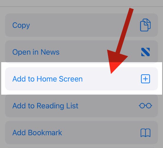
To add this web app to your homescreen, click on the "Share" icon

Then click on "Add to Home"
To add this web app to your homescreen, click on the "Share" icon
Then click on "Add to Home"
It looks like your browser doesn't natively support "Add To Homescreen", or you have disabled it (or maybe you have already added this web app to your applications?)
In any case, please check your browser options and information, thanks!
It looks like your browser doesn't natively support "Add To Homescreen", or you have disabled it (or maybe you have already added this web app to your applications?)
In any case, please check your browser options and information, thanks!